Opening introductions in coming-of-age movies usually show the protagonist's everyday life or an important occurrence. The title is typically introduced during the opening few minutes of the film, frequently memorably or stylistically to set the tone for the film. Credits are typically put at the beginning or end of the film. In coming-of-age movies, choosing a font might differ significantly depending on the overall aesthetic and feel of the movie. However, titles and credits frequently include traditional, easily readable fonts that fit the tone and ideas of the film. Helvetica, Futura, and specially-made fonts for the movie are common options. We frequently see someone getting ready in the morning.
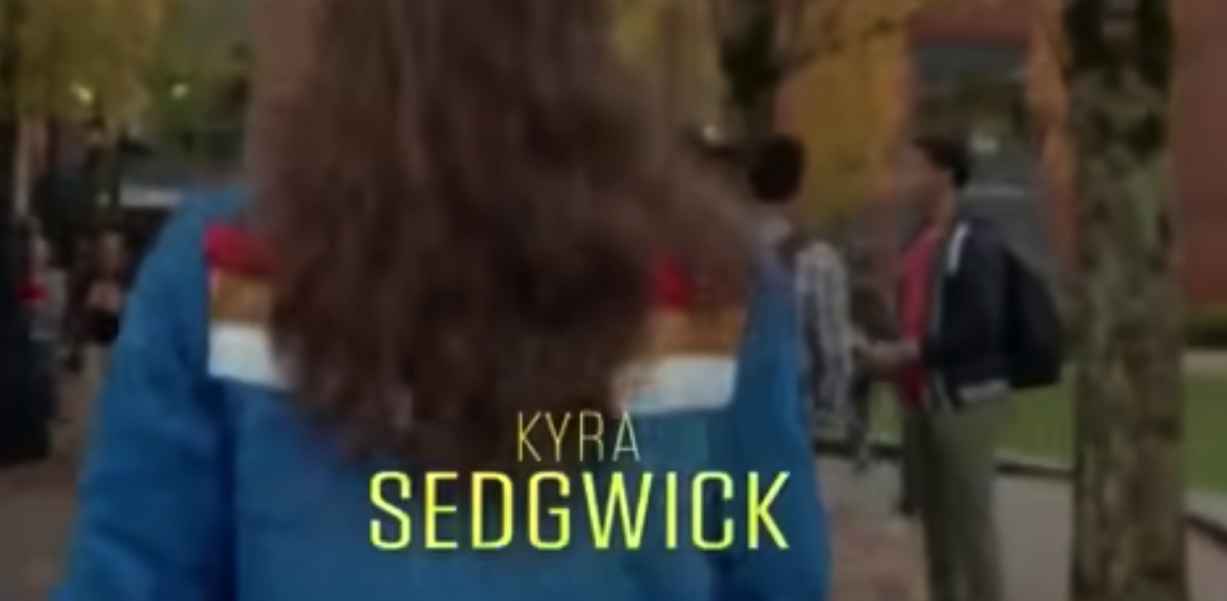
After researching and coming across "The Edge of Seventeen," the opening scene of "The Edge of Seventeen," the camera tracked Nadine, the protagonist. It panned across her high school hallway bustling with students. Nadine and the theme of this movie are heavily shown through the opening and introduced in a relatable scenario, navigating the awkwardness of adolescence. The credits appear in a contemporary and youthful font, reflecting the film's modern tone. The title "The Edge of Seventeen" could be shown through mise-en-scene, such as graffiti on a locker or a scribbled note, capturing the essence of teenage emotions. I noticed that the credits and the title are in the same color yet different fonts as the title has a larger, bolder font which we typically see in film openings.


No comments:
Post a Comment